1. Plotting
Let’s learn how to plot some simple graphs.
[1]:
set.seed(37)
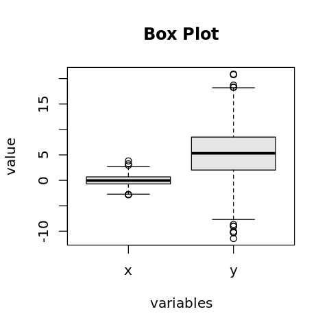
1.1. Box plot
Here’s an example box plot.
[2]:
x <- rnorm(1000, mean=0, sd=1)
y <- rnorm(1000, mean=5, sd=5)

options(repr.plot.width=4, repr.plot.height=4)

boxplot(x, y, names=c('x', 'y'), xlab='variables', ylab='value', col='gray90')
title('Box Plot')
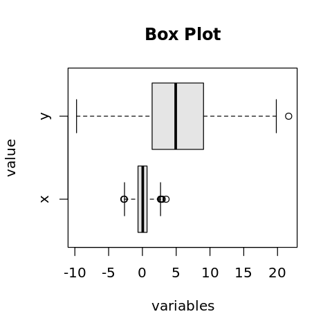
We may also change the box plot to be horizontal.
[3]:
x <- rnorm(1000, mean=0, sd=1)
y <- rnorm(1000, mean=5, sd=5)

options(repr.plot.width=4, repr.plot.height=4)

boxplot(x, y, names=c('x', 'y'), xlab='variables', ylab='value', col='gray90', horizontal=TRUE)
title('Box Plot')
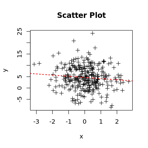
1.2. Scatter plot
[4]:
x <- rnorm(300, mean=0, sd=1)
y <- rnorm(300, mean=5, sd=5)

options(repr.plot.width=4, repr.plot.height=4)

plot(x, y, pch=3)
abline(lm(y ~ x), lty='dotted', lwd=2, col='red')
title('Scatter Plot')
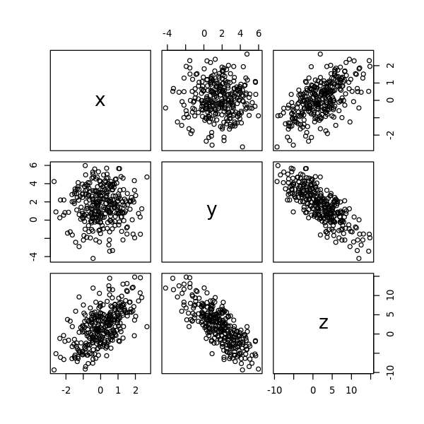
1.3. Pairs plot
The pairs plot shows multiple scatter plots on one graphic.
[5]:
x <- rnorm(300, mean=0, sd=1)
y <- rnorm(300, mean=1.5, sd=2.0)
z <- 5 + 3 * x - 2 * y + rnorm(300, mean=0, sd=1)

data <- data.frame(
    x = x,
    y = y,
    z = z
)

options(repr.plot.width=5, repr.plot.height=5)

pairs(data)
1.4. Line plot
[6]:
t <- seq(1:100)
s <- sin(t) + rnorm(100, mean=1, sd=1)

options(repr.plot.width=10, repr.plot.height=5)

plot(t, s, type='l')

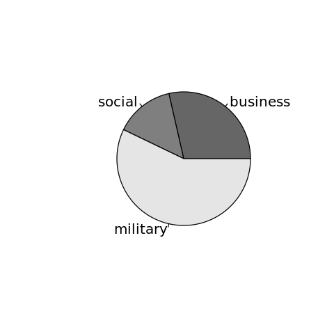
1.5. Pie charts
[7]:
e <- c(100, 50, 200)
l <- c('business', 'social', 'military')
c <- c('gray40', 'gray50', 'gray90')

options(repr.plot.width=4, repr.plot.height=4)

pie(e, labels=l, col=c)
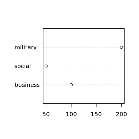
1.6. Dot charts
[8]:
e <- c(100, 50, 200)
l <- c('business', 'social', 'military')

options(repr.plot.width=4, repr.plot.height=4)

dotchart(e, labels=l)
1.7. Bar chart
[9]:
e <- c(100, 50, 200)
l <- c('business', 'social', 'military')

options(repr.plot.width=4, repr.plot.height=4)

barplot(e, names=l)
