2. ggplot2
The ggplot2 package helps you plot graphics with a grammar. The grammar provides a way to talk about parts of a plot. The grammar talks about the following components of a plot.
datais what is being plottedgeometric objectsare the shapes and lines that appear on the plotaestheticsare the appearance of the geometric objects and the mapping of variables to such aestheticsposition adjustmentis the placement of elementsscaleis the range of values for each aesthetic mappingcoordinate systemis used to organize the geometric objectsfacetsare groups of data shown in different plots
2.1. Geometries
2.1.1. geom_point
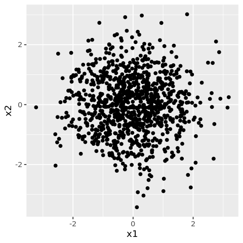
The geom_point is used for drawing individual points.
[1]:
library('ggplot2')
library('repr')

df <- data.frame(
    x1 = rnorm(1000),
    x2 = rnorm(1000)
)

options(repr.plot.width=4, repr.plot.height=4)

ggplot(df) +
    geom_point(mapping=aes(x=x1, y=x2))
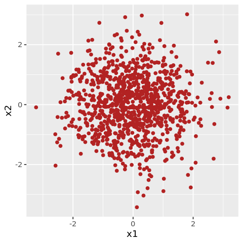
You may also style with the color attribute.
[2]:
options(repr.plot.width=4, repr.plot.height=4)

ggplot(df) +
    geom_point(mapping=aes(x=x1, y=x2), color='firebrick')
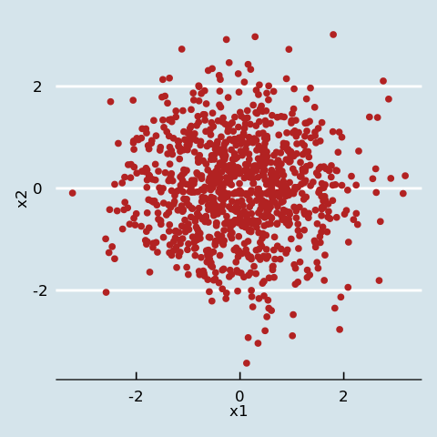
You may also style with themes.
[3]:
library('ggthemes')

options(repr.plot.width=4, repr.plot.height=4)

ggplot(df) +
    geom_point(mapping=aes(x=x1, y=x2), color='firebrick') +
    theme_economist()
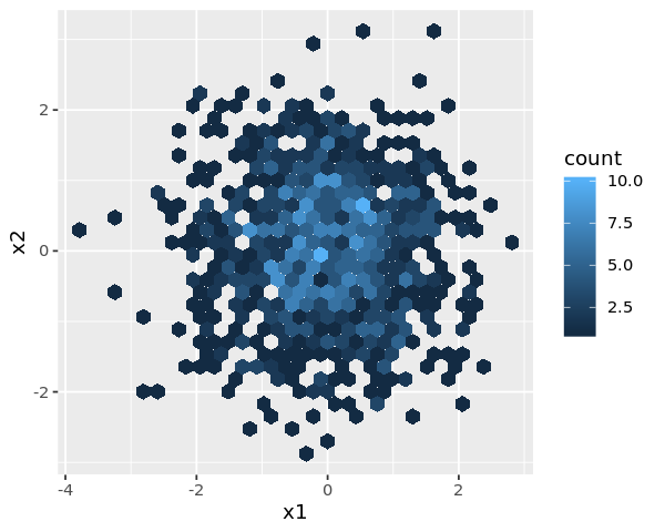
2.1.2. geom_hex
The geom_hex function is used for drawing individual points as hexagons.
[4]:
df <- data.frame(
    x1 = rnorm(1000),
    x2 = rnorm(1000)
)

options(repr.plot.width=5, repr.plot.height=4)

ggplot(df) +
    geom_hex(mapping=aes(x=x1, y=x2))
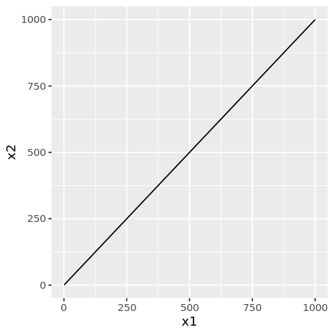
2.1.3. geom_line
The geom_line function is used for drawing lines.
[5]:
df <- data.frame(
    x1 = seq(1, 1000),
    x2 = seq(1, 1000)
)

options(repr.plot.width=4, repr.plot.height=4)

ggplot(df) +
    geom_line(mapping=aes(x=x1, y=x2))
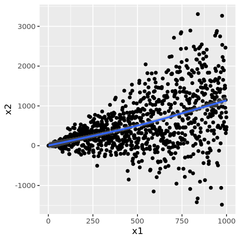
2.1.4. geom_smooth
The geom_smooth function is used to draw a smoothed line.
[6]:
df <- data.frame(
    x1 = seq(1, 1000),
    x2 = seq(1, 1000) + (rnorm(1000) * seq(1, 1000))
)

options(repr.plot.width=4, repr.plot.height=4)

ggplot(df) +
    geom_point(mapping=aes(x=x1, y=x2)) +
    geom_smooth(mapping=aes(x=x1, y=x2))
`geom_smooth()` using method = 'gam' and formula 'y ~ s(x, bs = "cs")'
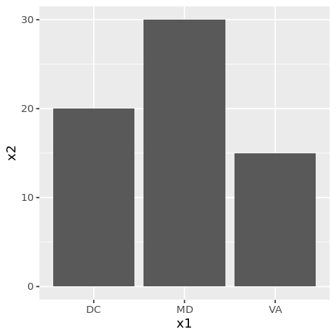
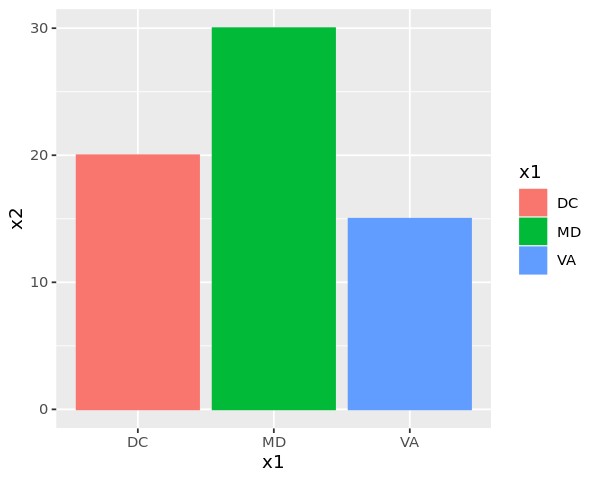
2.1.5. geom_col
The geom_col function is used to draw bars.
[7]:
df <- data.frame(
    x1 = c('DC', 'MD', 'VA'),
    x2 = c(20, 30, 15)
)

options(repr.plot.width=4, repr.plot.height=4)

ggplot(df) +
    geom_col(mapping=aes(x=x1, y=x2))
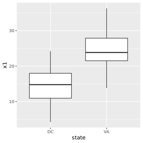
2.1.6. geom_boxplot
Use geom_boxplot to plot box-whisker plots.
[8]:
df <- data.frame(
    x1 = c(rnorm(100, mean=15, sd=5), rnorm(100, mean=25, sd=5)),
    x2 = c(rnorm(100, mean=15, sd=5), rnorm(100, mean=25, sd=5)),
    state = c(rep('DC', 100), rep('VA', 100))
)

options(repr.plot.width=4, repr.plot.height=4)

ggplot(df) +
    geom_boxplot(mapping=aes(x=state, y=x1))
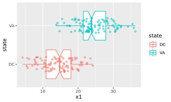
You may play around with attributes to change the look and feel of the box-whisker plot.
[9]:
options(repr.plot.width=5, repr.plot.height=3)

ggplot(df, mapping=aes(x=state, y=x1, color=state)) +
    geom_boxplot(
                 outlier.colour='green',
                 outlier.shape=8,
                 notch=TRUE
                ) +
    coord_flip() +
    geom_jitter(alpha=0.5, position=position_jitter(width=0.2))
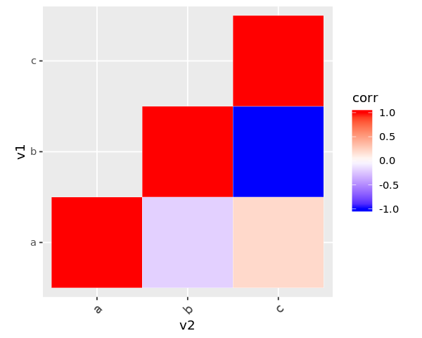
2.1.7. geom_tile
Use geom_tile to build correlation matrix plots.
[10]:
df <- data.frame(
    v1 = c('a', 'a', 'a', 'b', 'b', 'c'),
    v2 = c('a', 'b', 'c', 'b', 'c', 'c'),
    corr = c(1.0, -0.2, 0.2, 1.0, -1.0, 1.0)
)

options(repr.plot.width=5, repr.plot.height=4)

ggplot(df, mapping=aes(x=v2, y=v1)) +
    geom_tile(data=df, aes(fill=corr), color='white') +
    scale_fill_gradient2(low='blue', high='red', mid='white', midpoint=0, limit=c(-1, 1)) +
    theme(axis.text.x=element_text(angle=45, vjust=1, size=11, hjust=1)) +
    coord_equal()
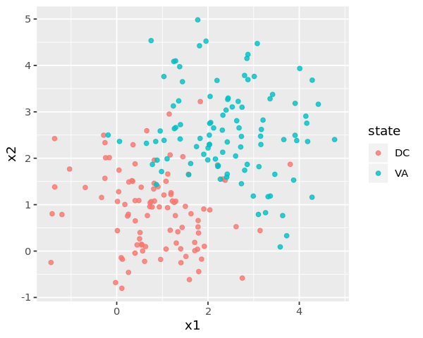
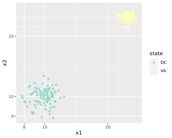
2.2. Aesthetic mapping
Aesthetics may be used to change colors.
[11]:
df <- data.frame(
    x1 = c(rnorm(100, mean=1, sd=1), rnorm(100, mean=2.5, sd=1)),
    x2 = c(rnorm(100, mean=1, sd=1), rnorm(100, mean=2.5, sd=1)),
    state = c(rep('DC', 100), rep('VA', 100))
)

options(repr.plot.width=5, repr.plot.height=4)

ggplot(df) +
    geom_point(mapping=aes(x=x1, y=x2, color=state), alpha=0.8)
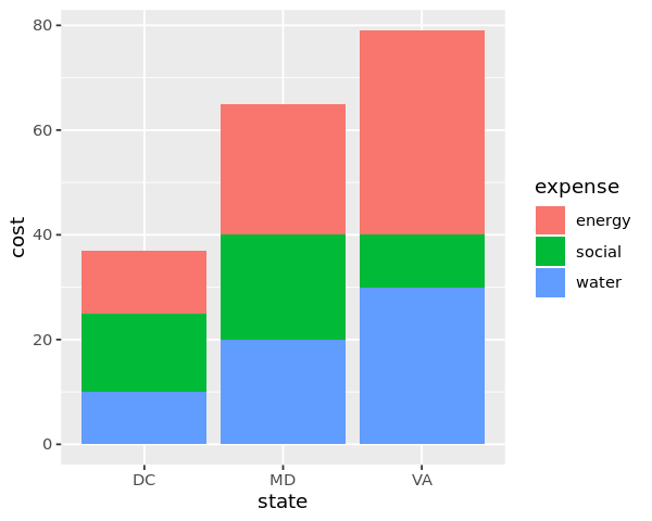
2.3. Position
Positioning can change the placement of elements and produce different types of plots.
[12]:
df <- data.frame(
    x1 = c('DC', 'MD', 'VA'),
    x2 = c(20, 30, 15)
)

options(repr.plot.width=5, repr.plot.height=4)

ggplot(df) +
    geom_col(mapping=aes(x=x1, y=x2, color=x1, fill=x1))
[13]:
library('tidyr')
df <- data.frame(
state = c('DC', 'MD', 'VA'),
water = c(10, 20, 30),
energy = c(12, 25, 39),
social = c(15, 20, 10)
)
n <- df %>%
pivot_longer(-state, names_to='expense', values_to='cost')
options(repr.plot.width=5, repr.plot.height=4)
ggplot(n) +
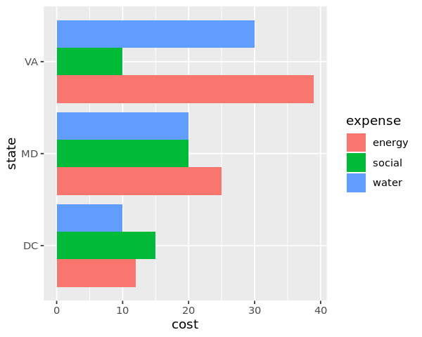
geom_col(mapping=aes(x=state, y=cost, fill=expense))
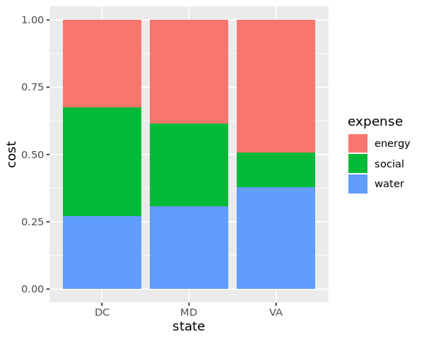
When position='fill', the stacked bars are forced to 100%.
[14]:
options(repr.plot.width=5, repr.plot.height=4)

ggplot(n) +
    geom_col(mapping=aes(x=state, y=cost, fill=expense), position='fill')
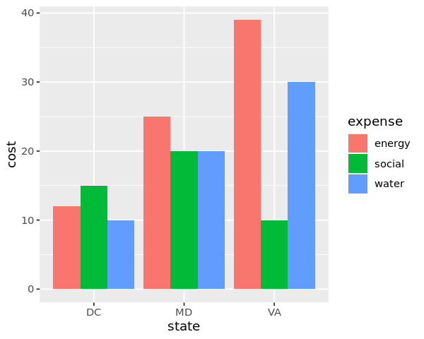
When position='dodge the bars are side-by-side.
[15]:
options(repr.plot.width=5, repr.plot.height=4)

ggplot(n) +
    geom_col(mapping=aes(x=state, y=cost, fill=expense), position='dodge')
2.4. Scale
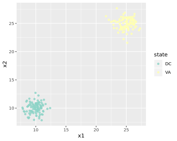
Scaling may help to zoom in or out of the plot, as well as rescale the axes. When you set axis limits with scale_x_continuous() or scale_y_continuous(), ggplot2 drops points outside those limits, which is why the next two examples emit warnings.
[16]:
df <- data.frame(
    x1 = c(rnorm(100, mean=10, sd=1), rnorm(100, mean=25, sd=1)),
    x2 = c(rnorm(100, mean=10, sd=1), rnorm(100, mean=25, sd=1)),
    state = c(rep('DC', 100), rep('VA', 100))
)
[17]:
options(repr.plot.width=5, repr.plot.height=4)

ggplot(df) +
    geom_point(mapping=aes(x=x1, y=x2, color=state), alpha=0.8) +
    scale_color_brewer(palette='Set3') +
    scale_x_continuous() +
    scale_y_continuous()
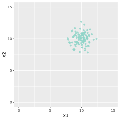
[18]:
options(repr.plot.width=4, repr.plot.height=4)

ggplot(df) +
    geom_point(mapping=aes(x=x1, y=x2, color=state), alpha=0.8) +
    scale_color_brewer(palette='Set3') +
    scale_x_continuous(limits=c(0, 15)) +
    scale_y_continuous(limits=c(0, 15)) +
    theme(legend.position='none')
Warning message:
“Removed 100 rows containing missing values (geom_point).”
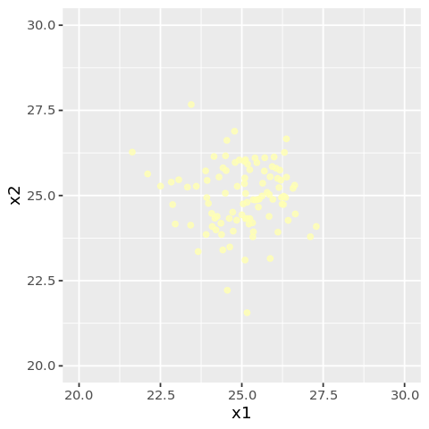
[19]:
options(repr.plot.width=4, repr.plot.height=4)

ggplot(df) +
    geom_point(mapping=aes(x=x1, y=x2, color=state), alpha=0.8) +
    scale_color_brewer(palette='Set3') +
    scale_x_continuous(limits=c(20, 30)) +
    scale_y_continuous(limits=c(20, 30)) +
    theme(legend.position='none')
Warning message:
“Removed 100 rows containing missing values (geom_point).”
[20]:
options(repr.plot.width=5, repr.plot.height=4)

ggplot(df) +
    geom_point(mapping=aes(x=x1, y=x2, color=state), alpha=0.8) +
    scale_color_brewer(palette='Set3') +
    scale_x_log10() +
    scale_y_log10()
2.5. Coordinate
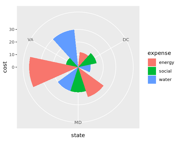
Coordinate functions such as coord_flip and coord_polar can change the type and look of a plot.
[21]:
df <- data.frame(
    state = c('DC', 'MD', 'VA'),
    water = c(10, 20, 30),
    energy = c(12, 25, 39),
    social = c(15, 20, 10)
)

n <- df %>%
        pivot_longer(-state, names_to='expense', values_to='cost')

options(repr.plot.width=5, repr.plot.height=4)

ggplot(n) +
    geom_col(mapping=aes(x=state, y=cost, fill=expense), position='dodge') +
    coord_flip()
[22]:
options(repr.plot.width=5, repr.plot.height=4)

ggplot(n) +
    geom_col(mapping=aes(x=state, y=cost, fill=expense), position='dodge') +
    coord_polar()
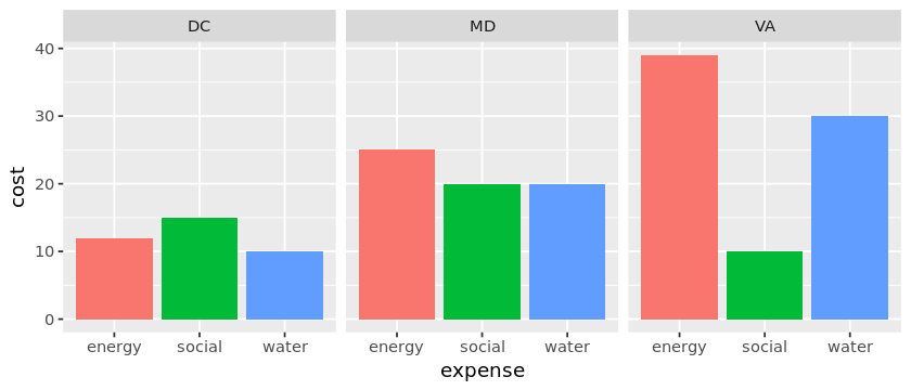
2.6. Facets
Facets can create subplots.
[23]:
df <- data.frame(
    state = c('DC', 'MD', 'VA'),
    water = c(10, 20, 30),
    energy = c(12, 25, 39),
    social = c(15, 20, 10)
)

n <- df %>%
        pivot_longer(-state, names_to='expense', values_to='cost')

options(repr.plot.width=7, repr.plot.height=3)

ggplot(n) +
    geom_col(mapping=aes(x=expense, y=cost, fill=expense)) +
    facet_wrap(~state) +
    theme(legend.position='none')
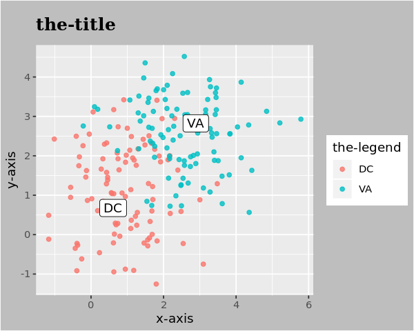
2.7. Labels and annotations
You may modify the title, axes and legend with labs. You may use geom_label_repel from the ggrepel library to annotate specific coordinates.
[24]:
library('ggrepel')

df <- data.frame(
    x1 = c(rnorm(100, mean=1, sd=1), rnorm(100, mean=2.5, sd=1)),
    x2 = c(rnorm(100, mean=1, sd=1), rnorm(100, mean=2.5, sd=1)),
    state = c(rep('DC', 100), rep('VA', 100))
)

centers <- data.frame(
    x1 = c(1.0, 2.5),
    x2 = c(1.0, 2.5),
    state = c('DC', 'VA')
)

options(repr.plot.width=5, repr.plot.height=4)

ggplot(df) +
    geom_point(mapping=aes(x=x1, y=x2, color=state), alpha=0.8) +
    geom_label_repel(data=centers, mapping=aes(x=x1, y=x2, label=state)) +
    labs(
        title ='the-title',
        x='x-axis',
        y='y-axis',
        color='the-legend'
    ) +
    theme(
        plot.title=element_text(
            size=15,
            face='bold',
            margin=margin(10, 0, 10, 0),
            vjust=1,
            family='Times'
        ),
        plot.background=element_rect(fill='grey')
    )
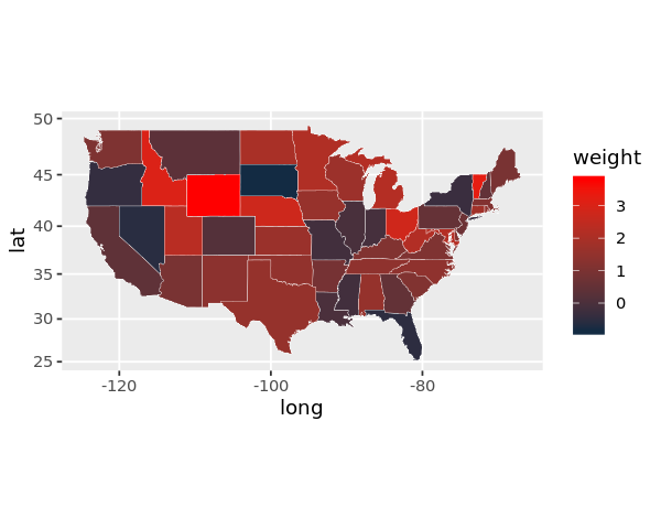
2.8. Choropleth map
[25]:
suppressMessages({
    library('dplyr')
})

allStates <- unique(map_data('state')$region)
x <- rnorm(length(allStates), mean=1, sd=1)

randomData <- data.frame(
    region=allStates,
    weight=x,
    stringsAsFactors=FALSE
)

df <- randomData %>%
    left_join(map_data('state'), by='region')

ggplot(df) +
    geom_polygon(
        mapping=aes(x=long, y=lat, group=group, fill=weight),
        color='white',
        size=0.1
    ) +
    coord_map() +
    scale_fill_continuous(low='#132B43', high='Red')
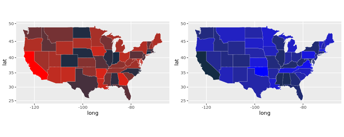
2.9. Subplots
Use the grid package.
[26]:
suppressMessages({
    library('grid')
    library('gridExtra')
})


allStates <- unique(map_data('state')$region)

randomData1 <- data.frame(
    region=allStates,
    weight=rnorm(length(allStates), mean=1, sd=1),
    stringsAsFactors=FALSE
)

randomData2 <- data.frame(
    region=allStates,
    weight=rnorm(length(allStates), mean=10, sd=2),
    stringsAsFactors=FALSE
)

df1 <- randomData1 %>%
    left_join(map_data('state'), by='region')
df2 <- randomData2 %>%
    left_join(map_data('state'), by='region')

plt1 <- ggplot(df1) +
            geom_polygon(
                mapping=aes(x=long, y=lat, group=group, fill=weight),
                color='white',
                size=0.1
            ) +
            coord_map() +
            scale_fill_continuous(low='#132B43', high='Red') +
            theme(legend.position='none')

plt2 <- ggplot(df2) +
            geom_polygon(
                mapping=aes(x=long, y=lat, group=group, fill=weight),
                color='white',
                size=0.1
            ) +
            coord_map() +
            scale_fill_continuous(low='#132B43', high='Blue') +
            theme(legend.position='none')

options(repr.plot.width=10, repr.plot.height=4)

grid.arrange(plt1, plt2, ncol=2)